FINISHING JOURNAL
Weathering the Falcon
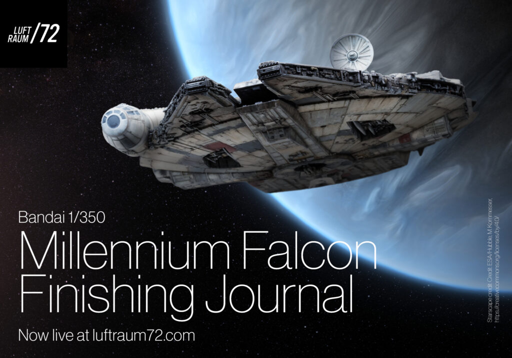
A finishing journal for Bandai’s 1/350 âfastest hunk of junk in the galaxy.â
Writing this intro last, after having written everything that follows, it feels like a bizarre amount of verbiage for 4â of model, and to that point, this is truly a journal vs a step-by-step. Completing this project was about the result, not the journey. Nor, if I’m being honest, did I expect to have *any* expressed interest in the process. As a result, steps were recorded sporadically, at best.
A few other caveats to bang out before getting on with it…
First, the studio models are dull. Those with stones in your pockets, you can throw them now. Donât get me wrong, I know the reasons, but as static models theyâre bland af. My plan going in was to create a rendition of the studio model through the lens of contemporary weathering â an interpretation recognizable as the Millennium Falcon, though not tied to any specific point in the movie arc. This approach granted the freedom to be imaginative, embrace happy accidents, and produce a more realistic-looking model, without fretting about absolute fidelity.
Second, working with oils. This project used oils exclusively for washes, filters and weathering. When I work with oils, I am constantly varying my colour mix, and never using a âbulk mixtureâ to be applied extensively across the model. I leach my oils on cardboard, then transfer small amounts to a white non-permeable mixing surface where I mix with any thinners or drying agents (usually VMS Oil Expert or Abteilung 502 Matte Effect Thinner). This mix-on-the-go approach provides more variation in my weathering effects, and leads to a more organic finish, imho. Finally, oils were allowed to dry for 12-24 hours between steps, unless noted otherwise. This is not only a practical reason, but also gave me that window of time to review the previous step, and adjust if necessary before moving on.
Third, these steps are recounted in the order I applied them. It was easier to remember, and avoids copy conflicting with the photos. However, the process as given did involve a few âWhy the eff didnât I do that 3 steps ago!â moments. Read through fully and adjust to taste.
Okay that’s it. Punch it, Chewie!
Starscape/planet image credit: Credit: ESA/Hubble, M. Kornmesser, https://creativecommons.org/licenses/by/4.0/
A long time ago, on a coffee table, er, 6 feet away⊠this build started over two years ago, not that long after picking up the the hobby again and before I had a proper bench set up. Eventually, it was fully-painted on one side and later, half-painted on the other (not that those two sides exactly matched, mind you). After an incentive to get it finished arose, a quick wash to remove shelf dust revealed an ugly truth. I must have thought about using hairspray chipping at one point, enough to add the hairspray at least, a fact clearly lost to time until the kit hit the water, and the paint pulled a vanishing act. Back to square one, strip what was left, and reprime.Â
Priming â Starting fresh, I primed with Mr. Finishing Surfacer 1500 thinned with Mr. Levelling Thinner (MLT). The Falcon uses a primarily warm colour palette, so dark grey with a touch of Red Brown was used as my base tone.
Underpainting I â A technique that riffs off an old masters technique, underpainting, or the way cooler name, dead-painting, involves building up a near-complete tonal range, then adding a thin glaze of colour to impart the desired hue. While it can be very time-consuming, I like this approach for the depth and patina it imparts to a finished surface. For the heavily-distressed finish I wanted for my Falcon, this was the (only) way.Â
Starting with the Ocean Grey, each panel was airbrushed freehand tight to the surface to create a mottled effect, working to âstay in the linesâ as best I could. Once the full ship was done, groupings of panels were give a quick broader application to create a more unified effect over subsections of the ship.Â
Soda chipping â Added once the first layer of underpainting was down, the model was misted with water and baking soda sprinkled over the surface in the same manner as the salt-masking technique. Once dry, the final distribution was adjusted, removing heavier concentrations with a moist brush, adding a more where needed. If the application looks heavy in the photos, some it will flake off under air pressure, while I’ll remove other spots as the paint process moves along, with the very last few applications being removed after the final colour coats.
Underpainting II â Underpainting then continued with a number of greys â Sky Grey, Medium Sea Grey, Medium Grey, JASDF Radome Grey (a cool grey for some contrast), and FS36622, all heavily thinned with MLT. The specific hues of grey applied were guided by reference photos, and their application mapped to the lighter areas imparted by previous greys. Once complete, each panel had ultimately received a dark, medium, and light grey.
I know this section is a bit of a mess in the telling, and lacks enough photos to tell the story, but when all was said and done, the final underpainted effect looked like a slightly darker, black and white version of the Falcon.
Creep and contrast.
The lighter greys were applied in a slightly higher concentration on the “high side” of panel joins. While the intent here is that gravity would pull grime down from panel joints and stain the upper portions of the panels below, it also has the benefit of creating slight contrast between panels, eliciting a subtle patchwork effect.
A take on panel line shading.
Airbrush panels from the edges in, keeping the sharpest part of your spray pattern â the arc directly below your airbrush when on an angle â tight to panel joins where you need demarcation. Over a dark  base, the final effect is more realistic and organic than a consistent overspray of each panel line.Â
Mix it up.
During the underpainting, I also used thin layers of polyethylene packing foam as a mottle mask, spraying the greys through them in random areas. This harder-edged mottling adds a needed textural contrast to the softer airbrush work.
Colour blocking â Using reference of the studio model as a guide, the panels were each given their final colour coats using a variety of colour mixes to approximate what I saw in photos, while the âwhitesâ were Gunze Mr. Color FS36622 and Tamiya White with a hint of Deck Tan (not Buff as shown in the photo, I grabbed the wrong pot before heading to the booth).
Working lightest to darkest, colour coats were sprayed freehand, panel-by-panel, tight to the surface, and highly-thinned for complete control of colour build-up. After all the âlightâ colours went down, I unified with a thin application of the white/deck tan mix. I then applied the darker greys, red, and a couple cool greys for contrast to the warm-toned colour scheme. Only when I sprayed these darker/saturated tones did I resort to using any hard-edged masks to avoid having to correct any overspray.
Varnish â Tamiya semi-gloss acrylic, highly thinned with MLT was sprayed over the entire model as a base for starting oil work.
Pinwash â Mixes of Light Mud, Dark Mud, and Raw Umber were whipped up and applied carefully over the model, allowing the wash to flow into detail from the tip of a fine brush, cleaning any tide marks or overflow with a brush and odourless thinner.
Once the first layer is finished, I immediately flip into weathering mode, and come back to those panel joins and details that would conduct fluids and grime, hitting them again with darker oils (Raw Umber, Burnt Umber, Payneâs Grey) to mimic effects of fluids that have seeped, stained, and trapped dust and grime. There’s no need to wait for the first pinwash to dry, any mixing here worked in my favour.
Streaking I â At this point I added the heaviest streaks, those that have probably been present for years. In my weathering hierarchy these legacy weathering effects are as much a part of the surface as the paint and need to come before any large-scale adjustments such as filters.
In contrast to the studio model, I drew my streaks down from the various small protrusions covering the surface, whereas the studio model draws streaks down from panel lines. Not sure why I went this route, it just kind of happened that way. Important to remember, streaks on the dorsal side taper with gravity to the perimeter, while streaks on the ventral side follow gravity to the centre. Using the same grime palette of oils from the weathering pinwash, streaks were added with a fine brush, and feathered out with a second brush, barely moistened with odourless thinner.
Highlights and Touch-ups â Using acrylics, I corrected overspray on a few panels, highlighted prominent surface detail and edges, and picked out the multitude of little square nubs with different tones of warm grey/whites.
Filters and Streaking II â Working in sections, filters made up of Light Mud, Dark Mud, and Dust were applied panel-by-panel. After giving the colour around 20 minutes to penetrate the surface, a fine brush moistened with odourless thinner was used to impart additional streaking effects to each panel by removing small amounts of the filter. This was followed by additional applications of the filter oil colours directly to some panels and streaked top to bottom.
Mapping â With the slightly visible underpainting as my guide, I bumped up the contrast of the distressed paint by mapping dark and light oils onto each panel, or into areas where I wanted to convey heavy fading or staining. Here, minute dots of oil, like flattened point of a pin minute, were applied to the surface, then carefully blended out out with a fine brush. As in the filter stage, it helps to divide the ship into sections and work to complete each section before moving on the next â similar, though not as involved, as the process Michael Rinaldi advocates.
Speckling â A light pass of grimy oils were speckled over much of the ship using an old, small brush and airbrush needle, with application heaviest on the underside. These speckles were were really fine, any large spots removed, and Iâm not convinced most didnât just disappear eventually! Those that did remain help contribute a subtle chipping effect.
Varnish â Gunze GX114 Flat, heavily thinned with MLT was sprayed over the entire model.
Role of the pinwash.
In my process, the pinwash is used for a subtle false shadow effect between panel joins. As such, 95% of my pinwashes are part of the colour application phase and use darker, desaturated hues of the base colour.
The remaining 5% of applications are for weathering where they represent fluid staining along panel joins and details.
Switching it up.
Some of the techniques at this stage may be out out sync with a “typical” process. There’s a reason, and it’s based in assigning certain weathering effects as being legacy (those which are as much a part of the surface as the paint) and others as dynamic (would come off with a good wash) and how they fall in the hierarchy of application of an older vehicle â and we all know the Falcon has been around the galaxy a time or two.
As a vehicle ages, dynamic effects can increasingly become legacy effects, and may need to be applied at a  different stage in the process than perhaps a similar vehicle with a comparatively short operational history.
As always, planning a process in advance â even if you end up deviating from it â will highlight when a break from the norm is necessary, and avoid a copy/paste weathering approach.
Maintenance Pits and Sidewalls â These were sprayed dark grey/black, then structures and details were picked out by both airbrush and paintbrush with colours lightening in tone as they came closer to the surface. Once done and dry, these were given the same oil effects mentioned in previous stages. At this time I continued picking out small details across the ship in different colours, simply to add more variation and interest.
Engine Exhaust â After a spray of dark grey/black, white acrylic was loaded into a brush, touched into the recess and allowed to fill each cavity until relatively opaque (it took about three applications) and any overflow touched up with a grey black acrylic. Once dry, Prussian Blue oil was thinned and flowed into each hole in a similar manner, and any excess cleaned up. While the finished result is okay, itâs definitely something to push in a different direction on a future build.
Cockpit and Cannon Ports â For the cockpit windows, I knew a black would be too stark a colour for the overall colour palette used. Eventually, I came across extra decals from my 109 build that had dark cool grey balkenkreuz â the perfect colour! With calipers, ruler, and sharp hobby blade, I was able to measure and slice the decal into enough pieces to cover the cockpit windows, while the front arch was cut with my Dspiae circle cutter, trimmed to the extent of the arc, applied, and once dry, the framing picked out with light grey.
At my next session, I then  masked over the cockpit by mistake and pulled half the decals up. Bollocks! I colour-matched a dark grey acrylic to the decals and repainted the affected windows along with the cannon port glass.Â
Blaster Marks â Burnt Umber and Payneâs grey mix to make a great charcoal black, ideal for the blaster scoring across the ship. The location of each was lightly drawn on with a dark grey Prismacolor pencil, then small dots of oils applied and brushed out to match the effects seen on the studio model. On a future build, I would also make a pint of adding the surface damage associated with a number of these hits.
Done, and mostly done â At this point I made the soft call that the build was finished, or at least ready for a bit of reflection. I shared it around, gathered some feedback, checked references, stared at it (a lot!), and finally took it back to the bench.
Varnish â Before adding the final corrections, another thin application of Gunze GX114 Flat, heavily thinned with MLT, was sprayed over the entire model.
Avoid my grille grief.
Heed my words, builders of the 1/350 version… the exhaust grille should really be painted and masked during the build phase! The gap is quite constricted when it comes to trying any paint effects.
Hold the black back, Jack.
Building in this small scale, black becomes a challenging colour to represent. Anything approaching true black carries too much punch, so restrain the dark end of your palette to dark greys, and save black for perhaps a small or singular elements, in this case, the blast scorching.
Final Details â Based on feedback, and what I picked up on reviewing photos again in detail, there were a number of small corrections and additions I needed to make to properly wrap this up:
Exhaust ports: The grilles received a heavy wash of Rubber Black acrylic, followed by a glaze of Raw Siena or Payneâs Grey oils to match the discolouration seen on the studio model. The characteristic exhaust stains were added with highly-thinned Rubber Black (I went a little asymmetrical here, though probably shouldnât have as it looks like a mistake â realistic doesn’t always ‘look’ right in scale) along with the staining visible from the smaller ports just aft of the main grilles.
Rust staining: There studio model displays a few areas of  distinct rust-coloured staining that were added to match â primarily around the centre section on the ventral side and a few streaks on the front side of main body. I also added some rust tones in the maintenance pits to add some pop and patina to those areas.
Satellite TV Dish: References showed a couple panels of the dish backside were a dark grey, so these were painted to match.
Yellow panels: There are a couple small âyellowâ panels on the top side of the studio model. I could only find one photo where they truly looked yellow, though as photos go, it looks heavily adjusted. Instead, I simply  glazed a bit of yellow over the beige I had already and found that punched them up enough.
Markings: a close inspection of photos shows a plethora of small markings spread all over the ship. These range from simple hash-marks in black and red to markings that are in many cases corporate logos from the real world, ie. the famous logo mash-up over the cockpit glass or the Champion Spark Plug logo on one of the panels. Using my finest brush these were reproduced as best as I could manage. Desaturated acrylic colours were used to ensure they blended in with the now fully-weathered finish. Additional details continued to be tweaked with acrylics.
Staining: There is some diffuse staining around the tips of the mandibles and the base of the circular centre section on the studio model. This was simply misted on with a highly-thinned Rubber Black.
Colour correction: A few panels had an additional filter applied to unify them better with adjacent panels.
The time to love is later.
The emotional investment and closeness we have to our work makes it all too easy to overlook the obvious. During the build, strive to distance yourself from your work. Â Good critique, both from yourself and others is essential to ensuring there’s no loose ends or regrets when the time to love your work finally arrives.
If you made it this far, my thanks! I hope this journal has been both interesting and helpful for painting and weathering a Millennium Falcon in any scale.
My thanks to Chris Becker of Becker’s Models for his input on early versions of this journal. Hit up his Facebook page or Youtube channel for quality scale model content.
Chris asked if I intended to include a conclusion… “Bloody hell, I’m glad that’s done!” That’s my conclusion.
Seriously, Bandai’s kit is a gem, all the more so for the low, low price of less than a tenner that they run here in Canada. That the build looks as good as it does is due, in no small part, to the level of detail packed into it by Bandai, and I’ll need no arm twisting to do another one. Just not right now.
Find more fun scale model shenanigans on my Facebook, Twitter, and Instagram.
Â